Artist: Bruce Springsteen
Song: The Wrestler
http://www.youtube.com/watch?v=uK6smwWg8bc
Lyrics
Have you ever seen a one trick pony in the field so happy and free?
If you've ever seen a one trick pony then you've seen me
Have you ever seen a one-legged dog making its way down the street?
If you've ever seen a one-legged dog then you've seen me
Then you've seen me, I come and stand at every door
Then you've seen me, I always leave with less than I had before
Then you've seen me, bet I can make you smile when the blood, it hits the floor
Tell me, friend, can you ask for anything more?
Tell me can you ask for anything more?
Have you ever seen a scarecrow filled with nothing but dust and wheat?
If you've ever seen that scarecrow then you've seen me
Have you ever seen a one-armed man punching at nothing but the breeze?
If you've ever seen a one-armed man then you've seen me
Then you've seen me, I come and stand at every door
Then you've seen me, I always leave with less than I had before
Then you've seen me, bet I can make you smile when the blood, it hits the floor
Tell me, friend, can you ask for anything more?
Tell me can you ask for anything more?
These things that have comforted me, I drive away
This place that is my home I cannot stay
My only faith's in the broken bones and bruises I display
Have you ever seen a one-legged man trying to dance his way free?
If you've ever seen a one-legged man then you've seen me
Tuesday, 27 September 2011
Monday, 26 September 2011
Eminem Music Poster

This is a poster for Eminem's single "Not Afraid". I like the way in which the name of the song stands out as the letters are in a big font size. The background image of Eminem is also good as it is very big, which is very eye catching and draws people's attention to it. The poster is quite simple as it only features the name of the artist and song as well as a picture of the artist plus a parental advisory warning, due to explicit language. The song I am thinking of doing is quite a simple song, as it does not involve a huge band but rather a solo artist, so I think that the poster advertising the singer/album should be quite simplistic, maybe with a picture of the artist and the name of the album.
Joe Strummer Music Poster

This poster is for Joe Strummer's album "The Future is Unwritten". I like this poster as it features a big picture of Joe Strummer, which is using the rule of thirds as he is not directly in the centre of the poster. I also like the reviews that are positioned next to him. From this picture the green boxes are hard to read but they are reviews from music magazines saying how good the album is. Also, I think the awards that the artist has won, the text in the large brackets, are a nice touch as they encourage people to buy the album because of the awards that it has received. The use of colour correction is also good as the background is in black and white yet the important reviews and other information are in brightly coloured boxes. The use of big fonts for the name of the album and of the artist are also good as it catches people's attention.
Green Day Poster

Bruce Springsteen Poster

This poster shows Bruce Springsteen (front row centre) with his accompanying band, the "Seeger Sessions" band. This poster is for a special Bruce Springsteen album where is he is accompanied by a country band. The poster features the artist and band that created the album as well as the front cover of the DigiPak (bottom left hand corner). The poster also features two website links where the album can be bought from. I like the use of colour correction for the poster as the brown effect makes it seem quite old fashioned, which is good as the Seeger Sessions use old fashioned instruments and sing old fashioned songs.
Bruce Springsteen "Working on a Dream" DigiPak

I like the front cover as the lead singer is in a cartoon form, which makes the DigiPak slightly more interesting, as it is not just a real life picture of the person. Also, it seems quite mystical because he looks as though he is floating on clouds, which can be seen as a reference to the album name "Working on a Dream" as it can be seen that his idea of a "Dream" is working on clouds.

I like the way that one image is used to cover both sides of the DigiPak rather than having two separate images.

The lyrics booklet is good as there are no big bold images but rather much more subtle ones, such as this one of the lead singer lying on hay.

I like the way in which the lyrics are positioned around the tree. This makes the back cover slightly more interesting as the lyrics are not just in a column but are separated into two columns by a tree. The bonus album "The Wrestler" is the song that I am considering doing for my music video.
Madness "Divine Madness" DigiPak

I like the front cover of this DigiPak as it shows the members of the group pulling funny faces as well as doing a strange walk. This is good as the name of the group is "Madness" and from the front cover, the user can tell that they are "mad".
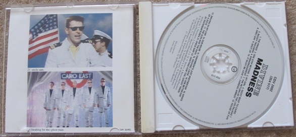
The inside of the DigiPak is good as the lyrics booklet features pictures of Madness during some of their music videos. The music video pictures are from the songs that are featured on the CD.

These are pictures from the music videos of the songs that are on the CD. The group live up to their name with their strange but funny music videos as they reenact weird situations and dress up as women.

I like the way that the names of the songs are positioned on the back cover of h DigiPak as they are laid out in an easy-to-read way.
Jack Johnson "In Between Dreams" DigiPak

I like how simplistic this front cover is as it just shows a man, the lead singer, picking an apple off the tree and this is good as it compliments the music, which is also quite laid back and simplistic.

The inside of the DigiPak is also quite simple as the CD features some leaves, maybe from the tree on the front cover, which I like as it gives the DigiPak a feeling of consistency. I also like the way the part of the DigiPak that holds the lyrics booklet has a diagonal line that allows people to see the lyrics booklet.

I like the lyrics booklet as it shows members of the group, or friends, relaxing on the beach. These pictures go with the style of the music as it is a "beachy" themed album with laid-back songs.

The back cover of the DigiPak features the trunk of the tree, which is seen on the front cover. I also like the way in which the names of the songs are laid out as they are in a font that is easy to read and the colours compliment the CD colour.
Green Day- American Idiot DigiPak
Green Day - American Idiot DigiPak


I like the use of the hand grenade heart as it is a reoccurring image throughout the CD lyrics booklet as well as through the music videos from the album. The front cover is also quite simple as the colours used are quite plain and the black background makes the white and black stand out.

The reoccurring hand grenade is used again on the actual CD as it is the same hand holding the pin of the grenade. Also, the same colours, black, white and red, that are on the front cover, are found on the CD and lyrics booklet. I also like how the names of the band members are one of the first things you see when you open up the DigiPak as they are in bold letters.

I like the text in the booklet as it is in a handwritten style, with mistakes crossed out which makes the band seem more approachable to fans as it shows that they make mistakes just like everyone else. I also like the way that the pages have loads of doodles on them.

I like the back cover of the DigiPak as the only picture is of the pin from the hand grenade, which can be seen as though he has thrown the grenade at someone or something.
Wednesday, 21 September 2011
Social Networking
I used social networking sites, such as Twitter, Facebook, MSN and Windows Live Messenger to share the link of my survey so that they would hopefully fill it in, as it will help me with my research on music videos.


Survey
I decided to make a questionnaire to help me find out more information about the types of music genres and videos that people prefer. I am going to use social networking sites, such as Facebook/Twitter/MSN/Windows Live Messenger to share my questionnaire and hope that people will fill it in.
This is the link to the questionnaire: http://www.surveymonkey.com/s/YHNP39G
These are the questions that I have used to create the questionnaire:
This is the link to the questionnaire: http://www.surveymonkey.com/s/YHNP39G
These are the questions that I have used to create the questionnaire:
1. What gender are you?
2. How old are you?
3. How often do you watch music videos?
4. What is your favourite music genre?
5. How do you watch music videos?
6. Do you prefer a music video with a lot of narrative?
7. Do you prefer music videos that have a good storyline or music videos that focus solely on the band?
8. What locations would you expect to see in an acoustic music video?
9. Have you heard of Bruce Springsteen?
10. If Yes, what kind of age range for an actor would you expect to see in a music video using one of his songs?
Subscribe to:
Posts (Atom)